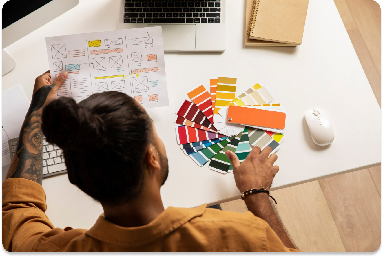
Colour Psychology in UI/UX Design: Enhancing User Experience Through Colours
Welcome to the captivating realm where art meets science in UI/UX design. Today, we'll explore the transformative power of colour psychology and its profound impact on user experiences. While we delve into this fascinating topic, we'll complement our discussion with real-world examples to illustrate the principles at play.
1. The Impact of Colour Psychology in UI/UX Design
Colours are more than just visual elements, they have the remarkable ability to evoke emotions and shape user perceptions. Take Facebook's calming blue interface, for instance. The choice of blue isn't random, it's strategically selected to foster trust and reliability, making users feel at ease as they navigate the platform.
2. Establishing Brand Identity with Colours
Brands like Coca-Cola understand the importance of consistent colour usage in forging strong identities. Their bold red branding isn't just attention-grabbing, it exudes energy and excitement, aligning perfectly with the brand's dynamic persona. This consistent use of colour reinforces brand recognition and loyalty across various touchpoints.
3. Creating Contrast and Readability
In the world of UI/UX design, readability is paramount. Consider Netflix's high-contrast colour scheme, with white text against a black background. This deliberate choice ensures optimal readability across devices and environments, providing users with a seamless viewing experience, whether on a smartphone or a TV screen.
4. Utilizing Colours for Visual Hierarchy
Effective visual hierarchy is essential for guiding users through interfaces intuitively. Airbnb achieves this seamlessly by using vibrant green for its call-to-action buttons against a backdrop of neutral tones. This strategic use of colour immediately directs user’s attention to key elements, enhancing the overall user journey.
5. Cultural Considerations in Colour Choice
In a world of diverse cultures, understanding the nuances of colour symbolism is crucial for global brands. McDonald's iconic red and yellow colour scheme, for example, resonates with audiences worldwide. While red symbolizes energy and passion, yellow conveys warmth and positivity, making the brand universally appealing across cultures.
6. User Preferences and Colour Research
Pinterest's pastel colour palette isn't just visually pleasing; it's rooted in extensive user research. By incorporating soft, calming hues, Pinterest creates an inviting environment that encourages exploration and discovery. This user-centric approach ensures that the colour palette resonates with users and enhances their overall experience.
Conclusion: Enhancing User Experience Through Strategic Colour Choices
In the dynamic landscape of UI/UX design, colours serve as powerful tools for crafting memorable and engaging experiences. By leveraging the principles of colour psychology, establishing consistent brand identities, prioritizing readability, crafting effective visual hierarchies, considering cultural nuances, and conducting user-centric research, designers can create interfaces that captivate and delight users. So, embrace the transformative power of colours in your design journey, and watch as your interfaces come to life with vibrant, memorable experiences.
